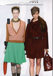
Visuals taken from the publication...


These are some visuals that could reflect this granny chic theme the styling with the JLS guys I could interpret with a model, also I love the image of the elderly lady. I love the fact that yes she may be a little older than the next style icon, but she is quite glamourous and you can see she has considered her outfit.


I love the images of the women who have been behind the bar in Coronation Street, just the use of the photoframes is really fun and for 'Our Betty' very fitting. This is something I feel Liz would have set up in her home- lots of photographs of grandchildren, performances, family etc. So when I consider my presentation for this brief I could replicate this.

No comments:
Post a Comment